Overview of release
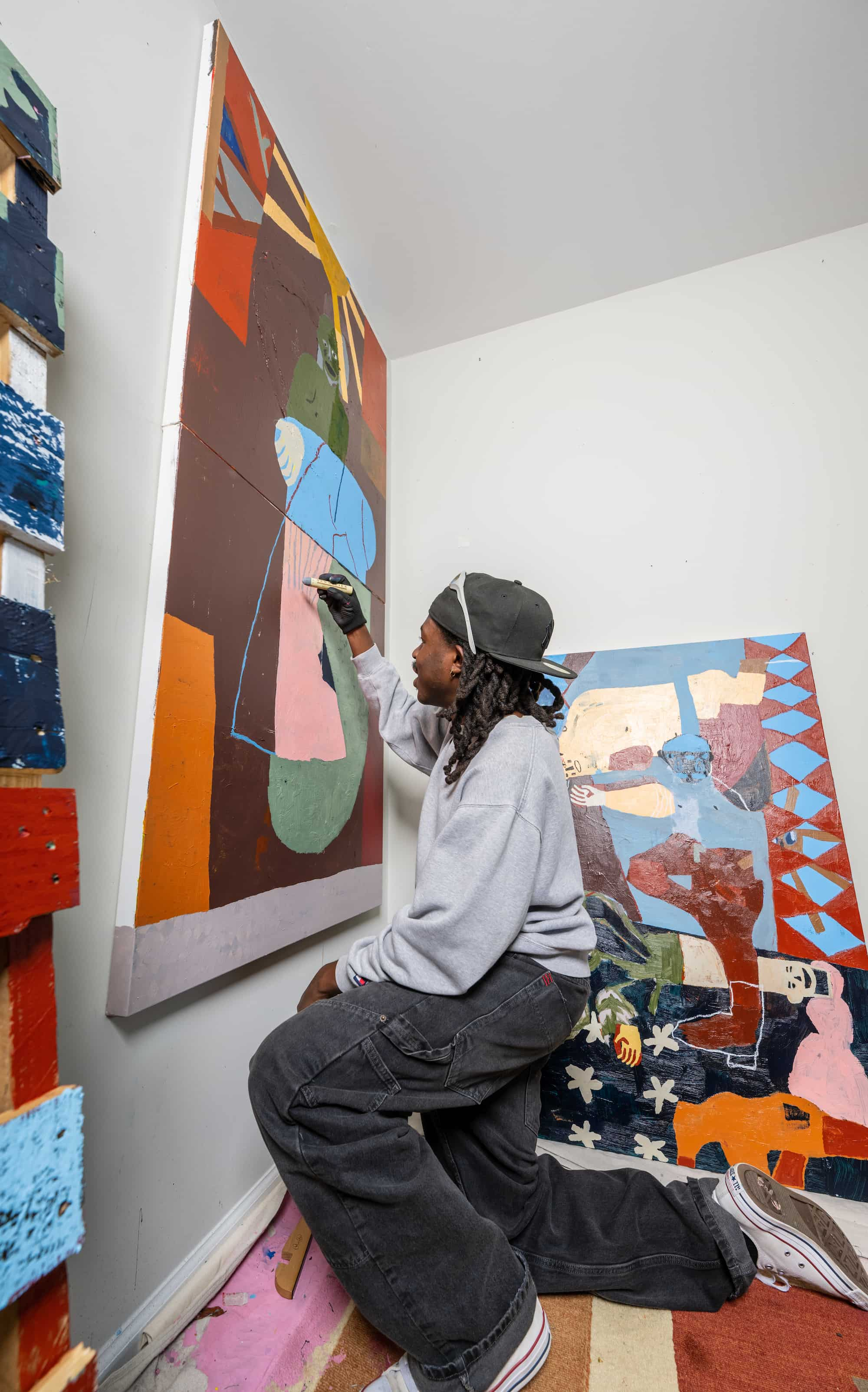
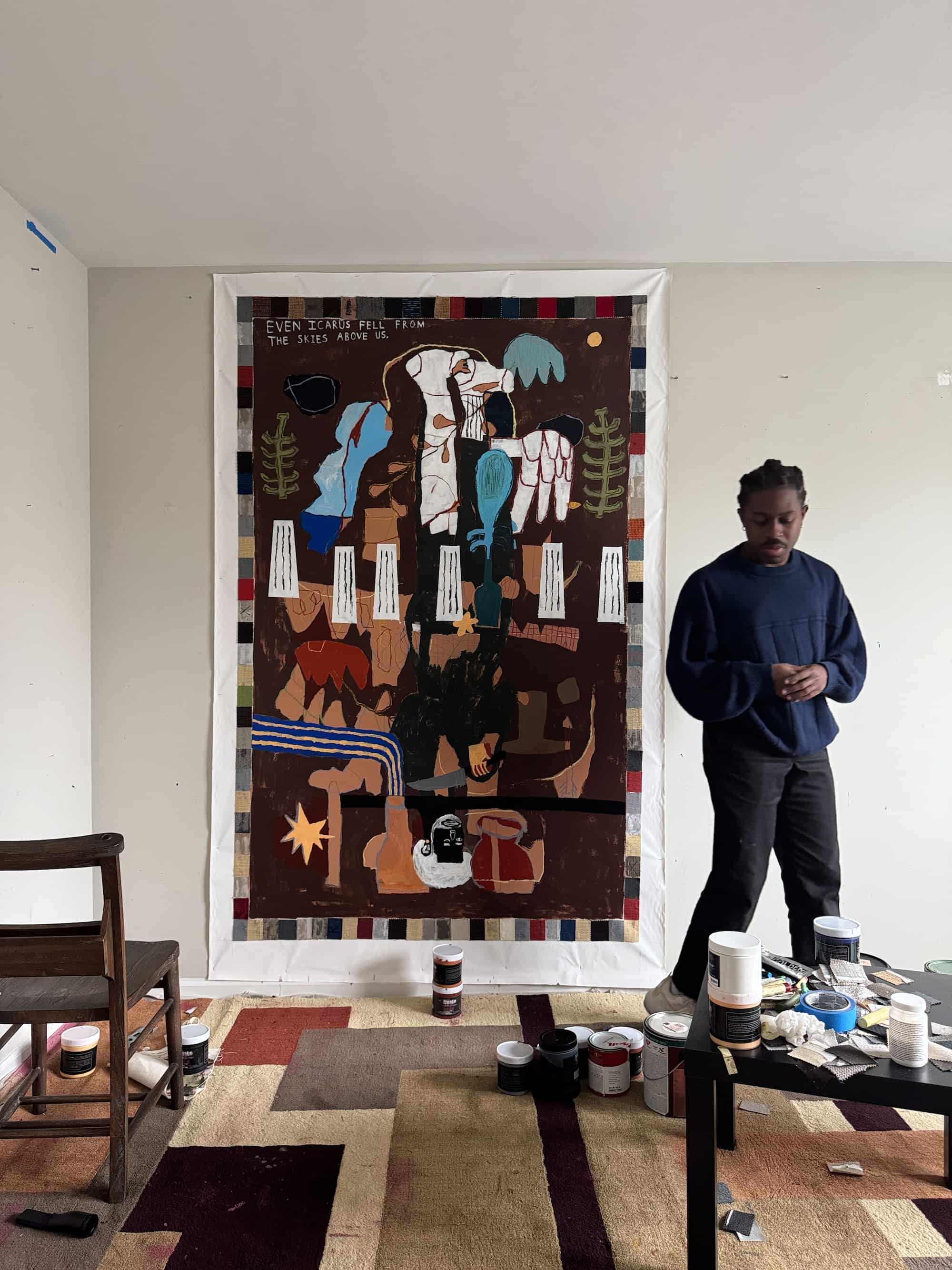
Bhare is no stranger to the power of art.
A pairing of two paintings balances a display of power and prose on heavyweight textured paper. Bhare, a first-generation, twenty-something American, encapsulates the strength of various eras in the UK’s history, honoring and reflecting on the past while pushing forward into a future intertwined with the artist’s personal experiences.
The prints presented are not merely illustrative; they carry the weight of a simple uniform, exuding authority and serving as a common antithesis for many artists. On a robust German etching paper, Bhare invites viewers to explore the looming themes of power, authority, and strength as they are cross-examined through the lens of a Black American.
Medieval and Victorian are Bhare’s debut set of limited edition prints with Peckham’s finest, Terracotta Prints.
What initially drew you to the medieval and Victorian eras as artistic inspiration?
Last month, I spent a week watching an animation about golf. They all had surnames that referenced King Arthur and his surrounding lore. Obviously, what came next was a one-eye shut deep dive at 3 AM under some LED lights. My curiosity branched over into finding bits of information about many time-periods across the UK. It was an itch under a 3-month old cast that just needed to be scratched.
How do you navigate the tension between romanticizing and critiquing these historical periods?
A way I’ve come to understand the balance is framing it around feeling vs knowledge. If the painting leans into a feeling of the time period, then it’s more romanticization on my part. It isn’t always a bad thing though. Vice versa, having more knowledge in the area lends my painting to a form of critique. I blend those lines as much as possible to tell a more engaging story.

Are there particular symbols, figures, or myths from those eras that recur in your work?
Not so much from a specific era. Recently, I’ve been utilizing disconnected heads within my paintings. I always have these moments of feeling spacey or as if I’m watching my body from a third-person point of view. These heads in my paintings are my lens to capture the moment. Watching my stories and life pass me by as a bystander.
What role does fashion or textile history play in this body of work?
Fashion and textiles have such inherent creativity to them. It’s another form of play in my opinion. As a Black American, we really place an emphasis on clothes we allow on our body. I approach my figures in the same way. I sparingly utilize clothing in my paintings and here they convey a sense of power. A common theme I found in my research was strength, authority and power. The textiles in their chosen uniforms validated that sense. From the shiny steel plates to the ribbon cord shoulder pads. I find it relates heavily to how I utilize clothing to convey my feelings and intentions.
How are ideas of nobility, faith, or fate visualized in your pieces?
I grew up as a church kid. I think no matter what, those experiences and messages inherently come out in my paintings through subtle imagery. Like the foot’s shadow in “Victorian” stretching out into the form of a cross.
What does “authenticity” mean when referencing such faraway times? Are you more interested in reinvention or preservation?
I would have to call in the textbook definition on this one. True to the source material. Though, I prefer reinvention over preservation. One that honors the past, learning from the good and bad parts to push forward.
How has working with medieval and Victorian references shaped your relationship to time or ancestry?
It’s made me realize my days of textbook learning are far behind me. History has always been one of my weakest subjects, as I found it hard to retain the information. I enjoy learning but when it’s an experience that I can really sink my teeth into. Are we traveling to the Mexican Pyramids to learn more about the Aztecs? Maybe to Germany to see the Cologne Cathedral and dive into the gothic period. Even an interactive museum gets the wheels turning for me, haha!
How do material choices—paper, pigment, texture—reflect the spirit of these historical periods?
A very fun question. I see these periods as a dark melodrama but fantastical in some instances, if I’m solely going based on western media. I leaned into thick and scratchy brushstrokes through both of the paintings. Specifically for the armor on one of the figures – a thick, heavy paint gives the impression that the armor has a real weight to it. Against a flat color background, it gives that section a moment to shine from near and far. Adding in scratches and dry wall tape into the melting pot, further pushes texture as a main element in the story. I envision the textiles and fashion in those time periods to have an emphasis on quality. Those in power had access to the finest of goods, in which some have stood the test of time in museum archives. Our choice of using German Etching paper was also intentional! The paper itself is naturally textured, almost akin to the feeling I get with the original painting. I find that it gives the paint an enhanced moment in the limelight and it is one of my favorites to work with.